Clearhealth
Coursera Project
Role:UX Design/Prototyping/Wireframing
Tools: Adobe Photoshop, Figma, Google Docs
Jan - March 2024
Overview
Clearhealth is an app I designed for a Coursera project to simplify and facilitate modern healthcare. It allows the user to book their doctor’s appointment, answer initial screening questions, and send refills to the pharmacy for prescriptions. By empowering users in their homes, Clearhealth reduces waiting room time, tailors their walk-in experience, and avoids unnecessary trips.
The Problem
Patients can often feel nervous and uneasy going into walk-ins for their concerns, this can be escalated by pain points at the doctors office. Pain points such as extremely long wait times, extra time used to answer initial screening questions, and unnecessary trips to the pharmacy for a prescription refill. These issues can often deter patients from revisiting walk-ins for health concerns and issues.
Solution
Through a comprehensive design process involving user research, persona creation, journey mapping, and continuous design iterations, I developed an app that enhances the patient experience. Clearhealth allows users to book appointments online with their preferred doctor at the medicentre, tailor their visit and specify their needs by completing initial screening questions and can order prescription refills from a pharmacy nearby or choosing.
Site Map and Page Goals
I started by mapping out the user’s journey by designing site maps and setting clear goals for each page. I went through a list of possible things the user would like to achieve when clicking on each page. After a few iterations, I refined the design to be more focused and straightforward. I found that the simpler the number of features, the easier it became for users to achieve what they wanted.
Lo - Fidelity Wireframes
Next, I sketched each page using lo-fi wireframes, focusing on specific objectives. I find pen and paper to be a simple and efficient way to explore ideas. Drawing the information architecture felt intuitive, as it allowed me to visualize how features would flow from top to bottom on each page. For example, I could place the current location feature at the top and then iterate what should follow, such as a list of available doctors or quick access to upcoming appointments and prescriptions. Creating these low-fidelity wireframes for Clearhealth also enabled me to gather early feedback from peers and make adjustments before committing to a final design.
Conceptualization
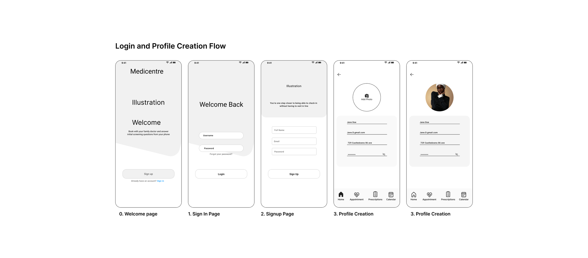
After sketching each page, I moved on to digitizing the screens. The shift from paper to Figma is a rewarding process as I see the designs start to come to life, even though it often begins with an awkward mix of gray boxes and uneven shapes. However as the information architecture evolves through several iterations, the designs become more polished. For Clearhealth, I leaned into a more structured approach by using design systems and gridlines to reduce guesswork and create a more streamlined design process.


The Solution
Clearhealth allows users to skip the lines and arrive when it is time, answer all the initial screening questions before arriving, and order prescription refills from the app.
Booking Ahead Of Time
A way of eliminating waiting room crowding was by designing an intuitive online booking system. This allowed the user to wait from wherever they wanted before coming into the Medicentre. This allowed the user to spend time how they wanted rather than waiting at the Medicentre for hours before being seen.
Answer Initial Screening Questions
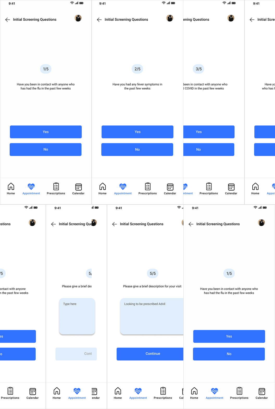
A way to reduce inefficiencies at the start of appointments was by creating screening forms. These forms informed the doctor of what the user intended and how they were feeling that day, without needing to be asked in person.
Order Prescription Refills Directly
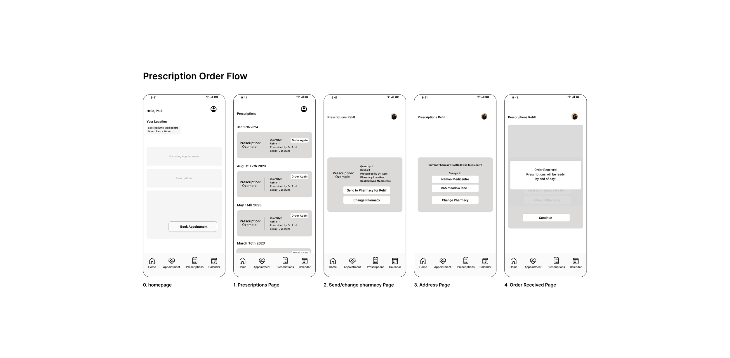
Noticing the inefficiency of users having to repeatedly visit the pharmacy for refills, I designed a feature that lets them easily order refills from their phone and send them to their closest or preferred pharmacy.
Usability Testing
It is critical to test usability constantly, one of the main focuses of every app as a designer is to make sure the app is useable by the user. These are some ways that I incorporated usability testing at various stages of the development of Clearhealth.
Color - Accessibility is a primary concern regarding color testing. In using WebAim, I ensured a user-centric and universally visible experience.
Type sizing - Readability and eye fatigue are primary concerns in font stylizing. By referencing guides and design systems, I was able to determine the appropriate font sizes.
Unmoderated User testing - Single-blind user testing with Clearhealth users ensured intuitive app design and flow.
Stakeholder Consultation - Of those who were consulted bi-weekly for feedback and revision on the functionality, content, and accessibility of the product.
Project learnings
Simplicity is strength
As a designer, I want to show off attractive, trendy, and inventive designs. However, our primary objective is functionality, especially with an app that offers such an essential service. Innovation in simplicity ensures that users aren’t suffering a lack of functionality for the sake of aesthetics.
Prioritize
This project benefited enormously from a clear and concise strategic plan and MVP. This facilitates incorporating out-of-scope requests and delivers a quality product on time.
Engage consistently with data-collection and feedback
Keeping the stakeholders/users involved and testing potential solutions in some form(paper, lo-fi, or hi-fi) as early as possible saves a large amount of time and rework. Furthermore, by collecting and implementing peer feedback throughout the project, I can ensure the final project is unbiased, user-centric, and accessible. Lastly, consistent and continuous user testing guarantees accessibility concerns.


