Artiva
Coursera Project
Role: UX Design/Prototyping/Wireframing
Tools Used: Figma, Adobe Photoshop
Nov - May 2023
Overview
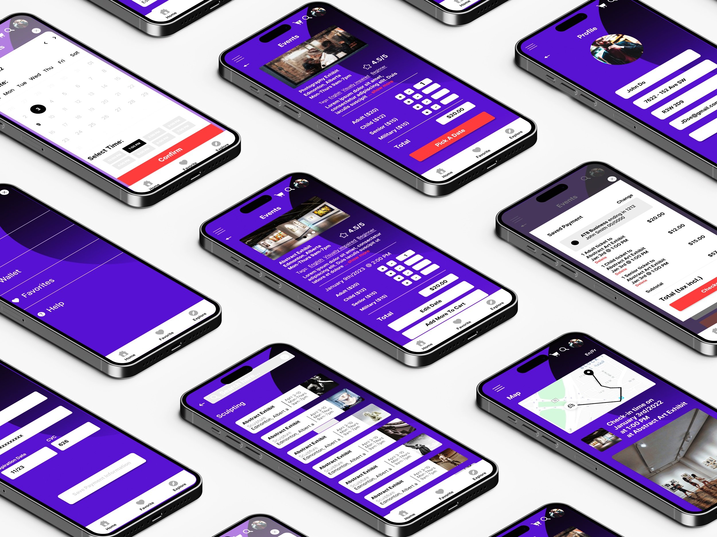
Artiva is an app I designed for a Coursera Project to simplify and enhance gallery visits. The app offers features that assist users with their tickets before they arrive. Through that same system, Artiva can help users with accessibility concerns regarding language, mapping, and events.
Artiva was the first app I designed as a Coursera Project where I went through the design process of user research, ideation, prototyping, wireframing, iterations, and testing. With Artiva I had experienced biases and pain points of thinking my way is correct and being proven wrong with peer reviews to learning how to navigate accessibility and usability.
The Problem
Going to art galleries can be an stressful experience. From feeling uninformed on exhibitions, struggling to find time in their schedules to attend, to accessibility concerns like language support. These are some of the issues that can compound affecting attendance which limits gallery patronage.
Solution
Through secondary research, including references like Ticketmaster and other online exhibit platforms, I gained insight into how ticket sales websites and apps are structured. This helped me identify and incorporate features into Artiva to address user pain points. Based on my research and design iterations, I created an event platform that displayed event bios, time, dates, and tags to categorize events, providing a clear preview for users. Feedback from peers also led to the idea of adding a language option for French and Chinese to enhance accessibility for non-English speakers.
Designing Story Boards
I began the design process with user research, followed by creating storyboards to explore different scenarios of how users might interact with a tour check-in app. The storyboards helped me visualize when and why a user would check in for tours at the art gallery and provided an overview of their ticket-buying journey.
Designing Lo-fidelity Wireframes
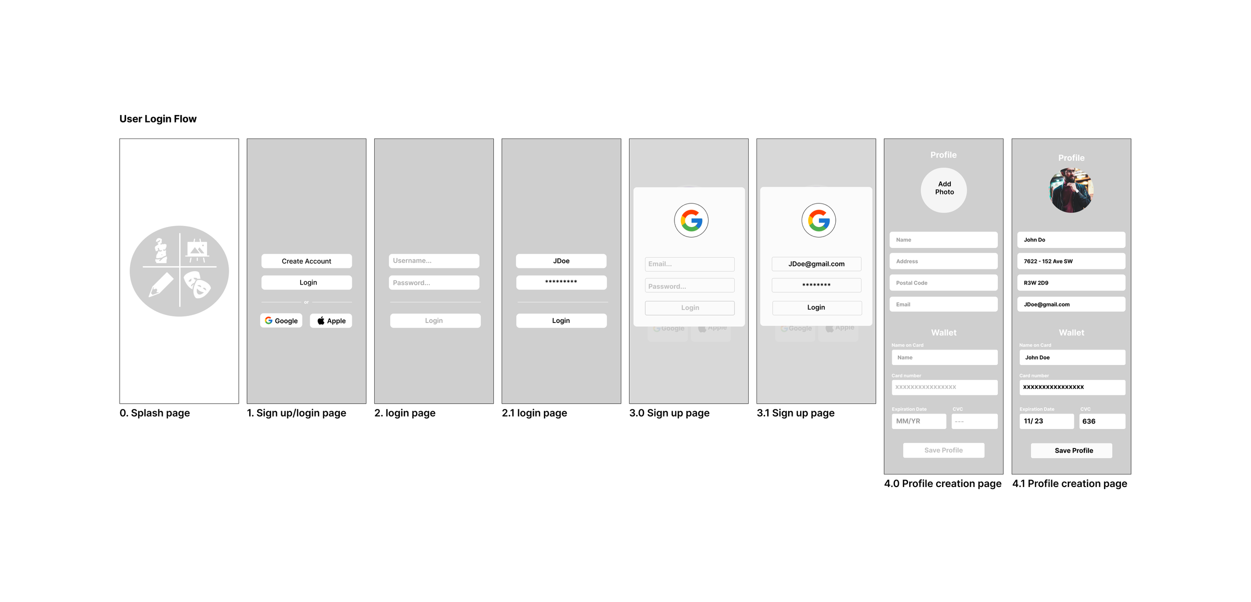
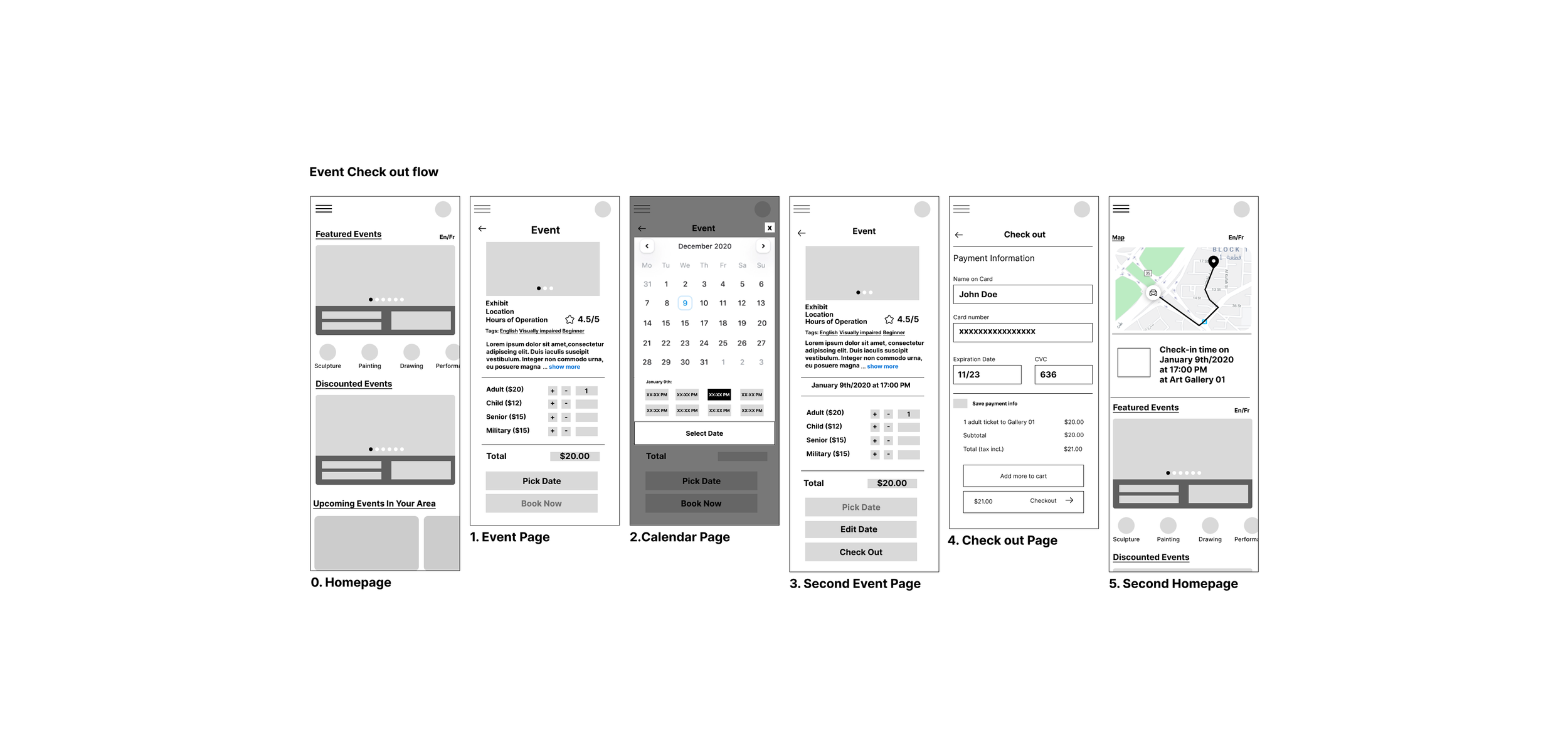
After reviewing the storyboards and considering how users might interact with the app, I moved on to creating low-fidelity wireframes. This process allowed me to explore multiple iterations and visually see what features might best fit the user. With that in mind, I sketched out different designs for key screens, including the events page, home page feed, and event categories.
Conceptualization
After reviewing my paper wireframes and developing the information architecture and lo-fi concepts for key use cases, I conducted usability tests with the lo-fi mockups. Once I felt confident in the design, I transitioned to using tools like Figma to digitize and prototype the designs, gradually refining them into high-fidelity versions. By mood boarding and referencing other apps, I drew inspiration and followed best practices for creating an effective ticketing app.


The Solution
Artiva makes it easy to check in to a tour ahead of time, lets the user learn about the event prior with descriptions and images, and allows the user to switch the language or filter events by language.
Event Purchase
In order for users to skip waiting in lines, I designed a feature to allow users to purchase tickets easily and have customizability such as time, how many people are going, and the date to go on.
Exploring Events
Users were often frustrated by the lack of information available before attending events. To address this, I designed a filter and detailed event bios, allowing users to browse through events until they find one that interests them and read in-depth descriptions to determine if its right for them.
Language Support
A critical accessibility issue was language barriers. Since Art is for anyone, I wanted users from all over to be able to use the app. With that in mind, users can change the app to their preferred language.
Usability Testing
A key takeaway from the Coursera course and other sources was the importance of continuous testing, which I applied with Artiva. As a newcomer to UX, I learned to welcome peer feedback, revealing issues like low visibility of call-to-action buttons, poor color contrast, and awkward app flow. Usability testing also highlighted challenges in real-life implementation and provided suggestions for improving accessibility, such as using Google Translate for French and Chinese translations.
Unmoderated Peer Review
Throughout various stages of development, I sent my peers versions of Artiva for them to test by completing assigned tasks and prompts. Based on their usability experiences, I gathered feedback and made necessary adjustments.
Moderated Mentor review
I am fortunate to have a UX mentors who provides valuable feedback. With their guidance, I could send them app versions, receive real-time critiques, and make immediate iterations.
Project learnings
User journey maps and storyboards
Creating journey maps and storyboards helped me deeply understand how users interact with the app and identify potential issues. These tools were crucial in shaping Artiva’s user-friendly flow and features. Learning to create journey maps was challenging, as it required stepping into the user's shoes to map out the ticket-buying process, summarizing key points of their experience and emotions. Storyboarding was also insightful, as it made me consider real-life scenarios where users might engage with the art gallery app.
Wireframing
Learning how to wireframe was crucial to the design process, enabling multiple design iterations and helping me generate and refine features. Paper wireframes were especially useful in shaping Artiva's user interface, particularly for ticket and event selection. Paper wireframes allowed me to visualize a simple, seamless ticket-buying process and start to eliminate potential pain points, ensuring a smooth user experience.
Prototyping
Prototyping was a new challenge that required me to fully visualize the app's flow and the end product. I had to carefully consider how each screen transitions, what happens when a button is clicked, and how to make the user's journey as smooth as possible. It was also my first time using Figma for prototyping, so I had the joy of learning its features, particularly around animations. Finding the right balance of animations was key—enough to enhance the experience without overwhelming the user.


