
Day 032 of Daily UI Challenge
What - Logo Design
Why - I wanted to keep my logo super simple, hoping it represents me as a designer and keeps things minimalist.
I always used my initials as an easy way to create a logo and my branding.

Day 031 of Daily UI Challenge
What – Designing a job listing.
Why – I used strokes around keywords to create a clear separation between items. Essential CTA buttons feature icons to make them more noticeable, and I differentiated primary and secondary buttons with distinct colors.
To enhance readability, I increased the font size of important headers, such as the job title, job details, and company overview, ensuring they stand out.
Day 030 of Daily UI Challenge
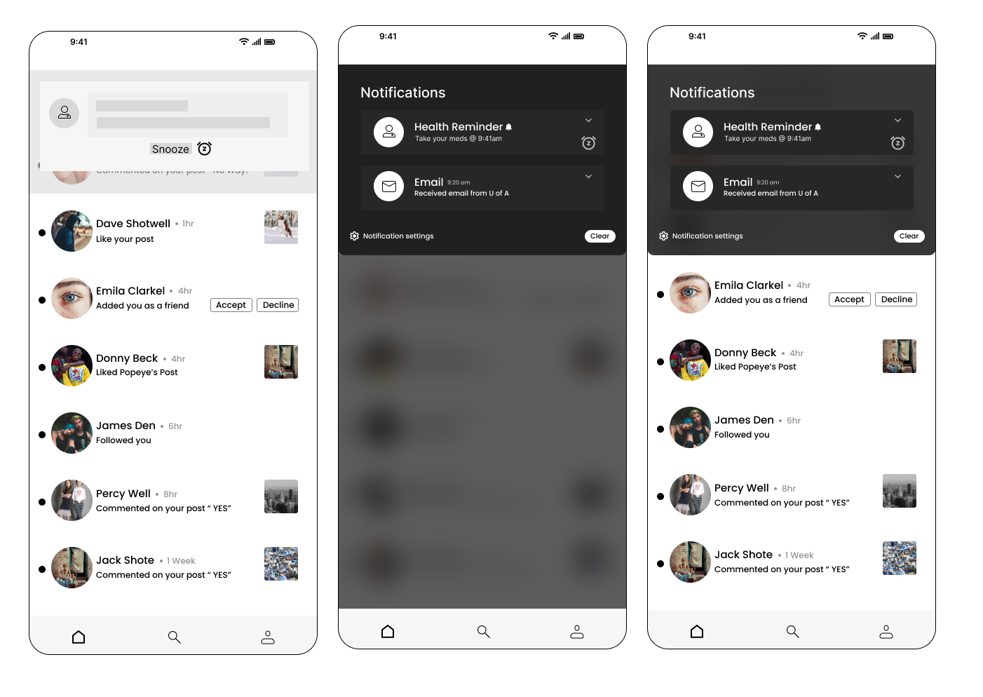
What - Design a Notification
Why - My phone’s notification system inspired me, incorporating essential features like a snooze button for reminders, a "clear all" option to dismiss notifications, and notification settings to control which apps or messages can send alerts. To enhance realism, I added a blurred background to simulate the experience of a notification appearing on-screen or being accessed by pulling down the notification panel. I also overlaid it on an app to replicate how notifications appear while a user is actively engaged in another task.
Day 029 of Daily UI Challenge
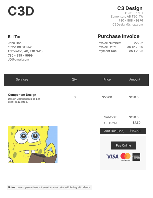
What - Design an invoice
Why - An invoice should have the essentials like who is paying, who is being paid, services provided, and how they will be paid for services. I added the vital information of who is paying and who is being paid at the top then working down to the services provided
ending the amount owed and options to being paid.
The layout of this invoice has a nice information architecture as you learn who the invoice is for, what it is for and how it is being paid.
Day 028 of Daily UI Challenge
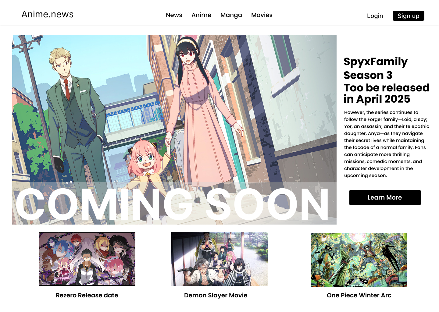
What - Design a Coming Soon Page
Why - I didn’t want to just do another countdown page for coming soon so I did a mock-up of an anime season coming page on a mock anime news website.
I added the coming soon in big bold letters and a layer between the image and coming soon to make the letters more visible.
I made the letters extra big and bold as they look nice, but they are also a big attention grabber along with the big hero image on the website.
I then put the body text to the right of the big hero image to give more context as to what the hero image is about and what is coming soon.
To make it feel like an anime page I added headers that were about movies and shows and at the bottom of the website, I added other anime mock-ups for shows and movies.
Day 027 of Daily UI Challenge
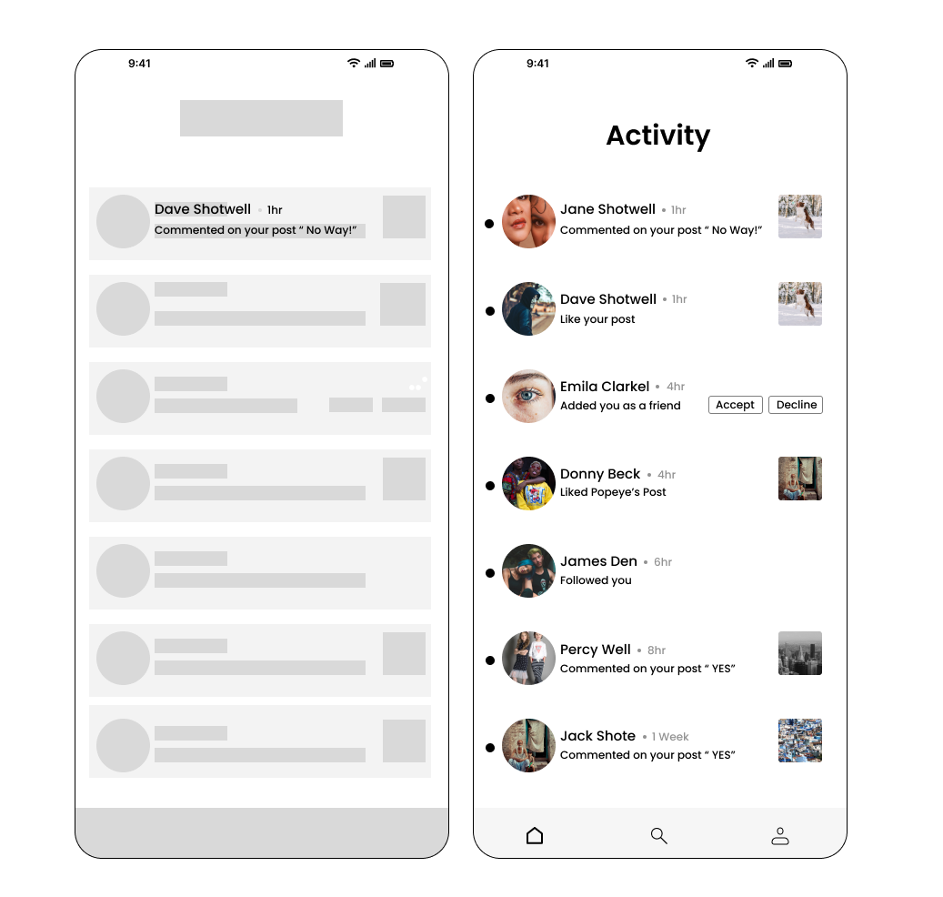
What - Design an Activity Feed
Why - I drew inspiration from Instagram and Facebook’s activity feed by including things like the user’s profile pictures and what activities they did like followed, liked, and commented on.
I added tots next to each profile picture to indicate a different person along with a different profile picture. I also added when the user did their activity next to the user

Day 026 of Daily UI Challenge
What - Design an Info Card
Why - I wanted to keep the info card simple with all the necessities. Things include name, level, when they were last on, and what games they play.
I chose a black theme so it would highlight all the necessities and you can quickly get a sense of what this person’s player tag in an instant.
With such a small info card I also made sure that spacing was all within 8 rems as the user may notice awkward spacing more with only so much to look at.
Day 025 of Daily UI Challenge
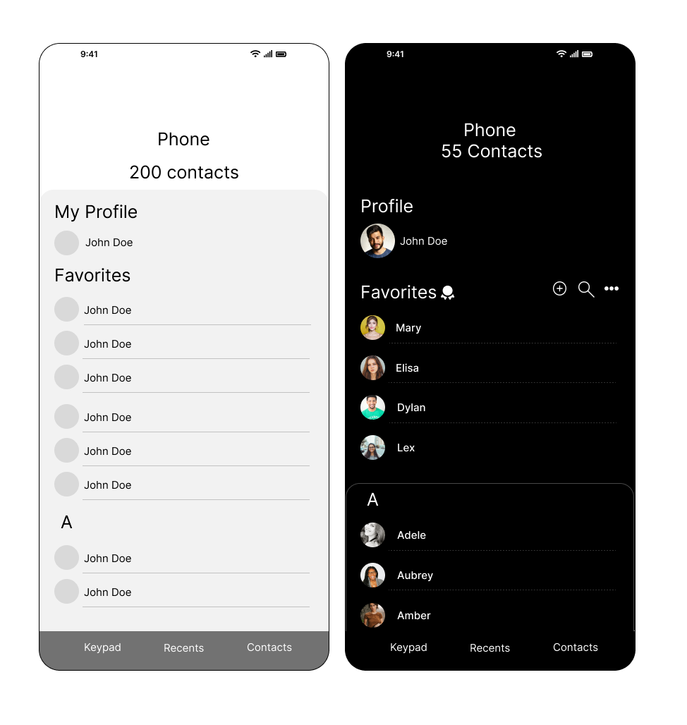
What - Design a Favorites List
Why - I added the little ribbon icon to emphasize the favorite’s contact list. I added a stroke to the card above the A to make it feel like a rolodex.
I used dotted lines instead of solid lines to make it a little more aesthetically pleasing. I chose a black background to leave more emphasis on the contact names.

Day 024 of Daily UI Challenge
What - Food Menu Items
Why - I added a profile icon so the user could check out their history.
I bolded the names of the burgers to distinguish between the burger name and the ingredients.
I added a quick add button for easy adding to the cart.

Day 023 of Daily UI Challenge
What - Design a to-do list
Why - I added a calendar at the top so they would immediately know the date and tasks associated with that day.
I went green check marks on the side to indicate when a task has been cleaned and the white ones for when they are still
to be completed. Also added the line through functions to show that they have been completed
I added the big add button on the corner to free up space from the bottom nav bar but also ease of access.
The underline under All was to indicate that the current page was displaying both tasks and reminders but having both categories
next to All indicated that you can go into separate categories.
Day 022 of Daily UI Challenge
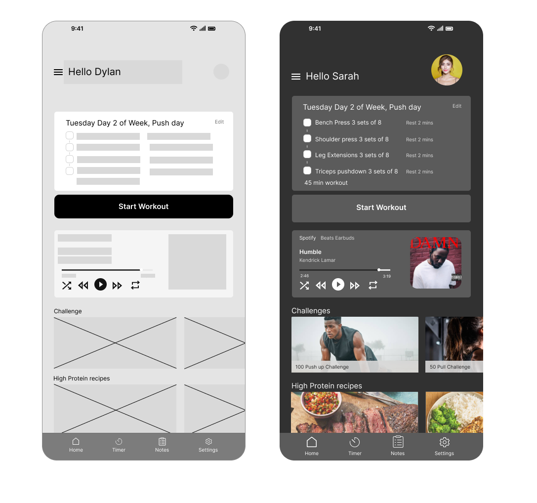
What - Design a Workout page
Why - my idea was to have everything a person working would want in one app. It has a workout plan, music, a timer for in-between sets,
challenges if they get bored, and recipes for refueling afterward.
I also added notes so they could write down how hard the workout was and what felt off or felt better this time.
I added an edit button so they can adjust their workout immediately. I changed the color of secondary information, such as rest for 2 mins, beats earbuds, and Kendrick
, as they are not as vital information but still need to be there

Day 021 of Daily UI Challenge
What - Design Testimonials
Why - with testimonials there are so many different types that are viable. The name can go first and immediately their rating and description or rating description and then name.
You could have the image on the card, in the middle of the card, or on top of the card, all for different styles.
I believe my favorite is name, rating then description. I chose this one because it shows important details at a glance. You get the person and their rating, the description can
be subjective. I also like having the avatar in the middle of the card with the white background as it adds a different style choice and is a bit more fun. Not so professional but
artistic.

Day 020 of Daily UI Challenge
What - Design a Food Recipe
Why - With this page I wanted the user to get the gist of what is needed and what they were cooking at a glance.
So the food they were cooking is at the top, how long to prep and cook, servings, ingredients, and a quick video to show how to make the recipe right away.
I highlighted buttons to indicate how many servings there are and how to save the recipe.
I added a filter over the film to make the play button stand out a bit more and not blend into the video making it
harder to see. Lastly, I added a search button for the user to be able to quickly search for ingredients or recipes.

Day 019 of Daily UI Challenge
What - Design a Calendar
why - I added the green important call to action buttons. I kept the design very minimal as I feel like scheduling dates can be quite stressful and needs to be less overwhelming.

Day 018 of Daily UI Challenge
What - Design a Weather Design
Why - I changed this app's secondary components, such as the daily humidity and wind and the weekly forecast to indicate that it was a bit different from the daily
weather and to break up monotony.
I wanted the current temperature to be the main focus by making it a large font size and the weather icon to be a different color from the rest as well. This way the user can
immediately know what the weather is like at the moment at a glance.
For mood boarding, I referenced the Android app I use daily for ideas. From it, I liked the idea of a 6-hour window of temperature and the weekly forecast.
I chose a light blue because it felt fitting for a 30-degree weather day, in the future, it could change as the weather changes to be dynamic.

Day 017 of Daily UI Challenge
What - Design a special offer
Why - with special offers I wanted to show multiple areas where the user would look that a special offer was happening.
I did this by putting a circle with the amount of dollars off, putting the sale price in red, and saying how much percentage off items were.
I also added an image of what items would be sold to entice the user. Without the image, it doesn’t give context as to what could be on sale.
I created two special offers, one is a card with a sweater on sale, second is a banner for a webpage that shows what and how much is on sale.e.
Day 016 of Daily UI Challenge
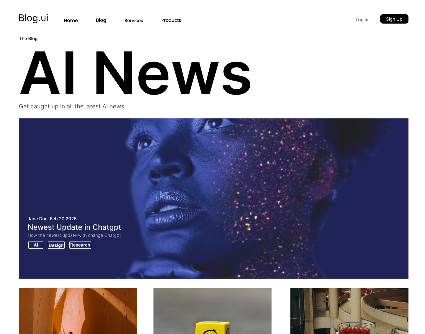
What - Design a blog post
Why - I wanted the first blog to be a massive hero image to grab the reader’s attention to the day's most exciting and important news.
I kept the webpage layout simple to draw less attention but also easy to navigate and not overwhelming. I changed the fill on the signup button to be a secondary call to action as I do want users to sign up for the blog. I used a white font on the hero image so the reader can read the header, author, tags, and dates of when the article was made.

Day 015 of Daily UI Challenge
What - Design a Settings Page
Why - Having played games for years it was fun to remember all the important settings needed in a game. Crucial options like sound can make or break a game.
Every guy with a graphics card wants to try and turn graphics up to the max. I also included the vital buttons like Apply to set all your settings you just changed but also
cancel and rest to revert to original specs.
I added percentages onto the ends of the dials just so if the user was extra particular they have a number to reference when adjusting sounds. Slight feedback by changing the Audio button from grey like the rest to full black to indicate that it is the audio page they are on.
Lastly, the settings in the top right reaffirm that the user is on the settings page.

Day 014 of Daily UI Challenge
What - Design a Profile Page
Why - I chose a circle for where the profile/avatar pic is supposed to go because that is a common practice.
I made boxes for the most common but that would cover most profiles' bases.
I added a Camera as an icon to indicate that it was a photo that was supposed to be added in this section for non-English speakers.
I filled in the call to action button to indicate that the profile had been filled and was ready to be submitted.

Day 013 of Daily UI Challenge
What - Customize Product Page
Why - I filled the Small size in black and changed the font to white to indicate that this was the selected size. I changed the stroke on the color to suggest that the color selected was white.
I changed the add to cart button to be filled as the primary button as we want the user to keep on browsing and shopping and not checkout just yet for the reason why checkout is not filled in.
I included a carousel-like image section on the left as to allow the user to click for different angles of the shirt.
Interested in seeing my other works? Click here!