
Day 012 of Daily UI Challenge
What - credit card checkout
Why - I kept the design very white but added little accents of blue to draw attention to the most important parts of the app like the CTA and progress of where you are in the credit card checkout.
I also wanted modern features like Google, and Apple Pay to give a sense of realism. I added dots to show progression and an empty circle to show the next step.

Day 011 of Daily UI Challenge
What - Lead generating landing page
Why - I wanted to create a landing page that was fun and colorful as I feel like this would grab the most attention and make the user feel good when they go to it. I grabbed inspiration and images from Figma as their website always inspires to be creative and makes designing feel fun.
The layout I chose for my landing page is also quite common and can give a user a sense of familiarity and ease as they’ve seen a layout like this before.
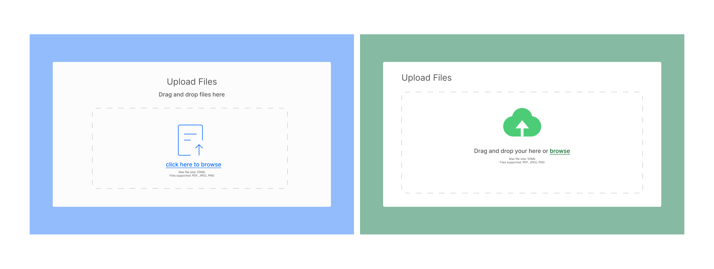
Day 010 of Daily UI Challenge
What - Design a file upload
Why - Based on mood-boarding images, they all seem to have a standard of what a file upload screen will look like. So I decided to design similarly, changing the icons and colors slightly. I chose to make the browse here a different color to give the user another option on how they would like to upload a file and the color change let the user know that it was something you can click and not just part of the text. That being said, I had extra time to make sure that all my icons, and squares, were lined up center and spaced correctly, I also was able to make sure all the colors were accessible to WCAG.

Day 009 of Daily UI Challenge
What - Design a Pricing Page
Why - I made the center pricing component a bit bigger and added a drop shadow effect to draw the user’s attention to our most popular option and make them look at it first.
I also changed the button's color to draw more attention and make the call of action button seem more enticing.
Having not only the most popular tag takes attention away from the cheapest plan but also having the best value tag as a section option makes it seem like
you aren’t giving up too much by choosing a more expensive plan.
I specifically chose blue to be the main color for this page as I usually associate music players with stress relief and relaxation.

Day 008 of Daily UI Challenge
What - Design a contact Page
Why - The most critical features to have with a contact page is the Name, Email and Message. This covers all basis on how to reach the user afterwards, who they are, and what the issue is in their message.
Second on this page is actually to have a phone number listed. This allows users who may not be as good with computers or may not know how to type in English reach someone by speaking.
Lastly, it is important that users read the message of checking spam folders. Too often do users expect a response quickly but do not realize that the one they are contacting is not apart of their safe senders list.
My design with the contact page gears more on the simple side but more critical functions. The user may already be frustrated or anxious to already resort to contacting the website, this could be exasperated
by having a overwhelming contact page. By keeping it simple, it allows the user to contact the website with ease, reducing any tension and frustration.
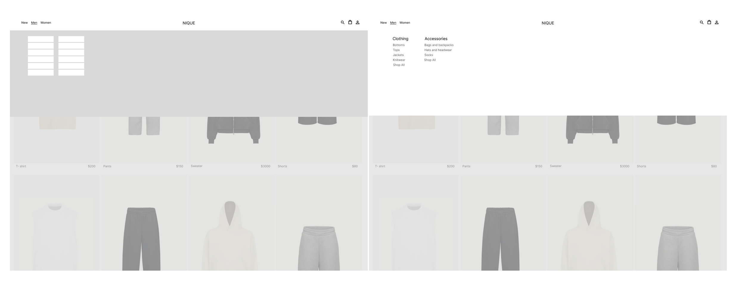
Day 007 of Daily UI Challenge
What - Design a dropdown
why - a dropdown menu is an easy and clean way to show many categories without cluttering the nav bar. It shows you all the categories related to the button you pressed on the nav bar.
I designed a simple and clean dropdown menu for the website so as not to overwhelm the user any more than necessary. Users already have so many decisions to make when shopping online
that having an overly complicated and crowded dropdown menu could potentially frustrate the user on the website.

Day 006 of Daily UI Challenge
What - Prompt: Design a subscribe Page
Why - The function of this page is to get the user to subscribe to either a newsletter or a product.
Rather than just having the logo and the subscribe button, with a page dedicated to this function we are able to go
further by telling what the newsletter is about and make subscribing to their email a little more enticing by using
The layout of this subscription is in a D form where it begins with big text on the left then draws the eyes of the user
to the image on the right then back to the big subscription button to end the loop.
This is a natural way to have the user scan everything on the page leading the user to subscribe using their email.
Changing the subscribe button color from its background is from an accessibility standpoint so it is easier to see
but also is more attention-grabbing as it is the main purpose of this page.

Day 005 of Daily UI Challenge
What - Prompt: Design a Boarding Pass
Why - Having been back from a trip myself recently and using an airline app to carry my boarding pass was a fun and new experience. No longer did I have to carry this flimsy paper that I was terrified of losing or being too crumpled in my backpack while in transit to my next flight. One convenient feature was the “view flight status” on a digital boarding pass, as my flight back home was switched and I had to switch gates and times, I didn’t have to go through security and another gate to get my new boarding pass, it sent me notification and when I reloaded my boarding pass it was set to the correct time and gate. Another convenient feature was the updating portion of the app that showed the progression up to your flight, as someone who can be quite anxious about timing, this was a very helpful feature to make know everything was going smoothly and on time.

Day 004 of 100 Daily UI Challenge
What - Prompt: Design Onboarding Page
Why - Onboarding pages can be a soft welcome to the user as they give them a preview of the app’s intention with small excerpts. It may also give the user a sense of relief to see the excerpts confirm that they have downloaded the correct app. My intention with this onboarding page was to give a quick preview with 3 rotating pages so as not to take up too much of the user’s time, and have a progression bar to know when they have completed the cycle.

Day 003 of 100 Daily UI Challenge
What - Prompt: Design a Search Bar
Why - Something that I feel is sometimes overlooked is a search bar. There is quite a bit of variance, and they can be crucial to websites. Imagine how frustrating it would be to go onto an e-commerce store and know what you want, but have to sift through tons of pages, just to find the one thing you wanted. For ideas, I went to some of my favorite websites like Apple, Uniqlo, and Nike, to see what kind of search bars they like to use and how variant they can be.

Day 002 of 100 Daily UI Challenge
What - Prompt: Design a Home Monitoring Dashboard
Why - Today’s challenge was to design a home monitoring dashboard that I would use myself. After mood boarding from looking at images on Behance and Dribbble, I gathered a few ideas that I liked. Ideas included having the internal temp be a big component and having an appliance section with all the lights I use daily like kitchen, and bedroom lights and appliances like TV or lamps. I also like to have music playing as I’m cooking or cleaning around my place, so having a Bluetooth component was also a nice feature. Rather than keeping it super simple by using a white background and one color, I opted for two tones with the components and the background of the app while using just a hint of yellow to accent the app. The hint of yellow is aesthetically pleasing but but also serves a useful function that grabs the user’s attention and is easy to find quickly to turn on/off appliances without having to look too much.

Day 001 of 100 Daily UI Challenge
What - Prompt: Design a Signup Page
Why - I chose to do an app version of a Signup Page because I thought this would be a good start to the challenge. Something that I would try to do daily, I wanted it to be easy it enough that it didn’t feel overwhelming but just enough of a challenge that it didn’t feel like I was going to be bored.
I designed a signup page for an app called Lollipop(not an actual app just the name). I began with moodboarding various images I found from Behance and Dribble to get inspiration and what other designers have done. Once I found enough pictures and an idea of what type of signup page I wanted I began with a lo-fidelity wireframe and iterated it with different shapes and shades of boxes. I rearranged the text to be whether inside the boxes or outside and what corner radius for the Call to Action Button. Once I was satisfied with the layout, sizing, and shapes, I added color and tried to match the color of the image Lollipop, ultimately making the wireframe Hi-fidelity.
Interested in seeing my other works? Click here!